
The 106-year-old automotive giant changed its logo

Luxury carmaker Bentley has refreshed its iconic ‘Winged B’ logo for the fifth time in its 106-year history. The logo, which has been comprehensively revised for the first time since 2002, reflects the brand’s new design approach.
The new emblem will be presented to the public on a new generation concept car that will be introduced on July 8. According to the information in DonanımHaber, the brand's new three-story design studio will be opened at the Bentley headquarters in Crewe, England, on the same day.
Bentley's new logo features one of the most radical changes to previous versions of the brand. While the basic form is maintained, the wings have become more pointed and the logo has been enclosed in a thick frame.
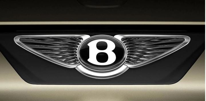
The classic feather details at the bottom have been completely removed. The most striking element is that the letter "B" has been made more emphasized and shaded.
Bentley Design Director Robin Page described the new logo as “simpler, sharper and more expressive than its predecessor.”
Bentley's first logo was designed by Frederick Gordon Crosby in 1919. The brand has changed the logo in 1931, 1996, 2002 and 2025 to date.
SÖZCÜ


